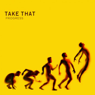
This is the newest album for Take That, Titled “Progress”. This album covers speaks a lot of words without any. The images shown represent the band as they are today, there are five different positions that the band members are positioned in, the first as if they are starting a 100 metre race and the last jumping into mid air, symbolising their career lifting off again., This works well with the title of the album, progress. They have recently had their band member Robbie Williams return, and this could be the way of showing, they are back in the prime of the careers. It also looks similar to the pictures used to show the evolution of mankind, meaning their music has evolved along with society today, the band has been around for a long time but this doesn’t mean they are the same band or have the same music as they did ten years ago. The colour of the album, a bright yellow, represents the sunlight coming back into the band, it gives a warm and happy vibe to the album itself which is appealing to people buying it. The bright colour also helps contrast with the images making them really stand out.
No comments:
Post a Comment